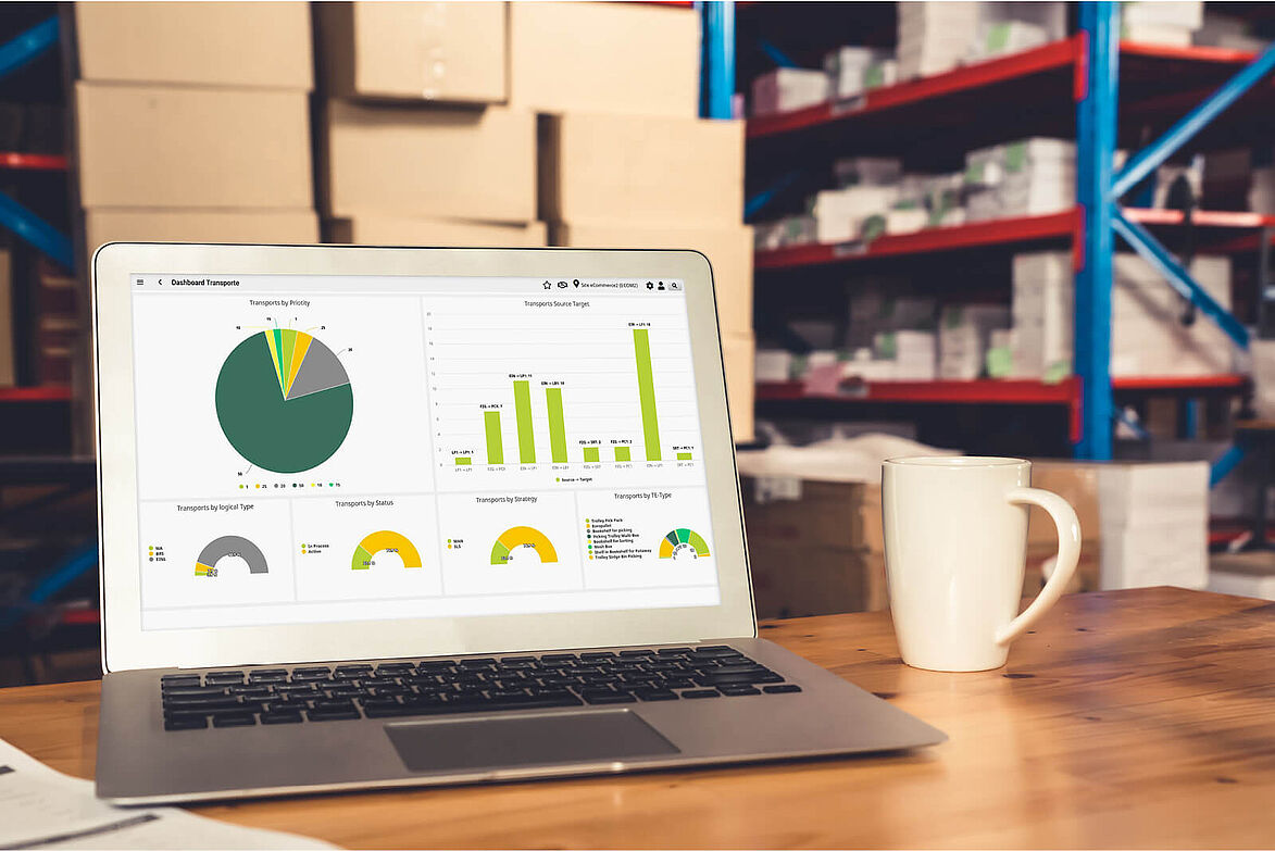
A good dashboard is essential for a warehouse management system (WMS) in order to provide logistics employees with all the latest relevant data. Users should be able to see at a glance what the status is in the warehouse and where action is required. What exactly does a WMS dashboard need to be able to do to meet these requirements?
What do users expect from a WMS dashboard?
A WMS dashboard should show the user the most important key figures for the warehouse in a simple and clear way. After all, the logistician basically only has one question: Is my warehouse running, yes or no? Possible problems that require intervention, the status of order utilization, any bottlenecks, etc. should be visible to the user at a glance.
A clear dashboard is characterized, for example, by visualized features; the traffic light system is particularly popular here. If there are no anomalies in an area, a green display conveys security. If there are problems, red signals the need for action. Such signals are immediately understandable for every user and are therefore highly recommended. However, the requirements differ depending on the department and a WMS dashboard can take account of the different expectations.
Requirements of different users
The interests of different WMS users vary, with the function of the user usually being the decisive factor.
For the warehouse manager, for example, the overall picture of the KPIs is primarily relevant - the throughput or the number of orders processed on a given day. Detailed values are usually less interesting for this user than the general order backlog and incoming and outgoing goods.
Logistics managers, on the other hand, obtain information about the entire logistics organization, using the WMS dashboard to gain an overview of capacity utilization within the various warehouse areas. The display should also show employee-related resources so that (temporarily) underutilized specialists can be deployed where support is needed.
Therefore exist area-specific dashboards for the individual areas of incoming goods, picking and packing, for example.

When is a dashboard dysfunctional?
A WMS dashboard should be simple and clearly laid out. Conversely, a dysfunctional dashboard is characterized by a cluttered design. Too many numerical values and information complicate the system and can overwhelm the user. If the dashboard is too granular and cannot display the required information at first glance, the likelihood of overlooking important information or only noticing it after a delay increases. If a dashboard is overloaded, users tend to be less motivated to engage with the dashboard content.
Individualization of dashboards
A dashboard should not necessarily have an industry-specific design in order to be of interest to a broad user base. With configurable widgets, as made possible by the WMS of PSI, views can be flexibly combined according to a modular principle and thus create individuality.
The compilation of ready-made widgets proves to be particularly user-friendly for inexperienced users. Even users with database knowledge benefit from the modular principle. PSIwms is structured in such a way that experienced users can formulate any queries that are then displayed graphically on the dashboard. For detailed data analysis, users also have the option of accessing additional screens via drill-down.
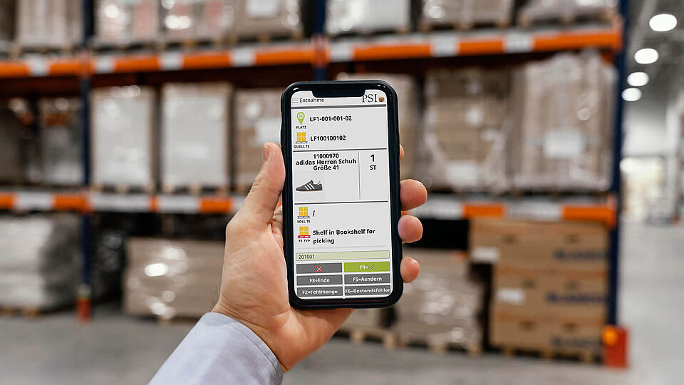
The dashboard also works as a web version, in which it offers the greatest possible flexibility, as the responsive design supports display on different end devices, such as a cell phone.
Conclusion: The art lies in simplicity
With a WMS dashboard, users can easily keep an eye on intralogistics processes, warehouse status and important information on the order, stock and resource situation, process monitoring and much more. The prerequisite for this is a simplified and visually appealing display panel that only provides the most necessary information at first glance.
A WMS dashboard can be used for different work areas and can be adapted to the individual requirements of each user.
For users with less IT experience, prefabricated widgets are available that already contain ready-made queries for the most common KPIs.
Thanks to the modular system of the PSIwms dashboard, more experienced users can create additional elements themselves. In this way, a dashboard can be optimally designed for different users.


